Intro

Search visibility rarely behaves the same way on two devices. A landing page can appear in the top three positions on a large monitor, yet drop below the fold on the phone sitting in a pocket. That gap explains why any serious audit now demands a split view. Looking at blended averages feels tidy, but tidy numbers often blur risky trends.
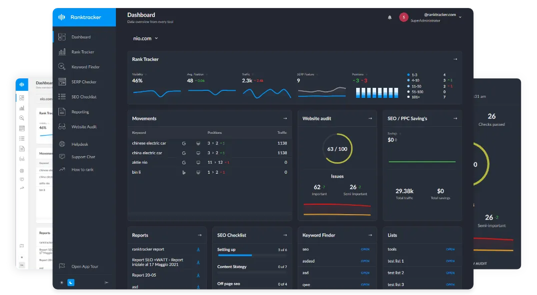
Many audit teams verify locations through a secure VPN, protecting session data while letting ranking checks mirror what real visitors in different regions actually see instead of the personalized clutter shown to a single office IP.
Different Screens, Different Signals
Desktop and mobile queries serve overlapping but not identical goals. Larger screens invite deep research: white papers, comparison grids, multi-step checkout flows. By contrast, phone searches thrive on speed, thumb-friendly menus, and immediate results. Google reacts by reshaping its result pages. A brand that ignores either slice accepts blind spots.
Key factors that shift between devices
- Pixel real estate – fewer organic spots fit on mobile before ads or maps push rankings downward.
- SERP modules – desktop may feature lengthy sitelinks while mobile swaps in swipeable carousels.
- User patience – desktop sessions tolerate heavier scripts; mobile visitors exit after three-second delays.
- Context – mobile intent skews local and transactional, whereas desktop leans toward detailed evaluation.
Recognizing these contrasts changes everything from content hierarchy to technical priorities.
Why Desktop Still Drives High-Value Research
Phones dominate daily browsing, yet conversions for complex products often involve keyboards and wide displays. Enterprise software demos, B2B quote requests, and legal consultations usually begin or end on desktop because multitasking between tabs, spreadsheets, and email feels smoother.
A desk-bound environment also reveals richer search features. Extended meta descriptions, side knowledge panels, and product grids stretch across the screen, allowing a site in position four to steal attention if its snippet feels sharper than the result above. Reports that overlook desktop rise or fall misread pipeline shifts until contracts slow.
Mid-funnel analytics repeatedly show that desktop visitors consume longer articles, download gated assets, and generate higher average order values. Ignoring slipping positions in that channel equates to forfeiting high-margin opportunities. Even consumer brands notice that larger baskets, warranty add-ons, and subscription upgrades skew toward big screens where comparison feels comfortable.
Mobile Search Is a Real-Time Decision Engine
Mobile sessions tend to happen closer to decisive moments: standing outside a store, comparing delivery fees, booking a repair slot before the next train stop. A delay of even half a second can reroute revenue to a faster rival.
Phone screens spotlight usability flaws hidden on larger monitors. Sticky banners, uncompressed hero images, and poorly scaled font sizes push vital text below the first scroll. Algorithms notice the bounce and quietly demote the page. This pattern explains why a site can celebrate “stable rankings” yet watch mobile traffic flatten.
Common mobile pitfalls uncovered by dual-view audits
- Oversized pop-ups covering primary content.
- Buttons positioned too near the screen edge, causing accidental taps.
- Lazy-loaded images without dimension hints, leading to layout shifts.
- Form fields too narrow for auto-fill, increasing abandonment.
- Menu icons that disappear against background video on sunlight-lit screens.
Spotting and fixing these issues early prevents ranking erosion and protects brand reputation.
Building Reports That Tell the Whole Story
Good documentation shows movement, but great documentation explains movement. Splitting metric tables by device highlights whether a dip points toward code debt, content drift, or external competition. When crafting a dual-screen summary, analysts should pair raw ranking shifts with click-through rates, overlay mobile and desktop heatmaps to show scroll depth, and annotate SERP screenshots so decision makers understand exactly which modules steal visibility on each screen.
The All-in-One Platform for Effective SEO
Behind every successful business is a strong SEO campaign. But with countless optimization tools and techniques out there to choose from, it can be hard to know where to start. Well, fear no more, cause I've got just the thing to help. Presenting the Ranktracker all-in-one platform for effective SEO
We have finally opened registration to Ranktracker absolutely free!
Create a free accountOr Sign in using your credentials
Equally important is connecting performance metrics to revenue. A slight drop on desktop may cost less than one position lost on mobile if the phone version drives appointment bookings or in-app purchases. Setting threshold alerts for each device keeps the team proactive rather than reactive. Finally, including Core Web Vitals broken out by template type helps designers link speed budgets to business impact without drowning in technical jargon.
Turning Dual Insights Into Action
Data without application amounts to dashboard art. Once a gap emerges, priority should shift to the device where loss hurts revenue most. For some brands that means compressing images and shrinking CSS payloads; for others it involves expanding desktop content modules abandoned during a mobile-first redesign.
Coordination between development, design, and copy teams accelerates progress. One updated component can benefit both screens if implemented thoughtfully, such as accessible accordion FAQs or SVG icons replacing heavy PNG sprites. Meanwhile, continuous rank checks through region-specific VPN endpoints confirm whether fixes resonate with the algorithm and real users simultaneously.
Future-Proof Planning
Search will keep evolving as foldless phones, voice queries, and augmented reality overlays reach mainstream use. Yet the principle behind dual-screen reporting will remain: understand the user environment before drawing conclusions. By treating desktop and mobile as complementary windows into intent, marketers trade guesswork for clarity, protect revenue across channels, and prepare the roadmap for whichever device comes next.
Ultimately, search today works like a two-lane highway. Focusing on only one lane invites blindfold driving. By sampling both, teams swap ignorance for insight, headaches for foresight, and frantic patch-ups for measured, confident growth.